Dienstag, 6. September 2011

Poppers by R. Weber


RUSH - 2011, oil on wood panel, 10 x 10 cm (top)
NITRO - 2011, oil on wood panel, 10 x 10 cm (bottom)

The Pharmaceuticals by R. Weber


Botox and Syringe - 2011, oil on wood panel, 12.5 x 18 cm (top)
Oxycodene - 2011, 2011, oil on wood panel, 10 x 15 cm
Potassium Iodide - 2011, oil on paper, 11.5 x 9 cm
Chinatown Viagra - 2011, oil on wood panel, 10 x 15 cm (bottom)

The Botanicals by R. Weber


Poppies 1 - 2011, oil on wood panel, 10 x 10 cm (top)
Poppies 2 - 2011, oil on wood panel, 10 x 10 cm
Cannabis 2 - 2011, oil on wood panel, 10 x 10 cm
Cannabis 1 - 2011, oil on wood panel, 12.5 x 18 cm (bottom)

The Boys by Katharina Arndt


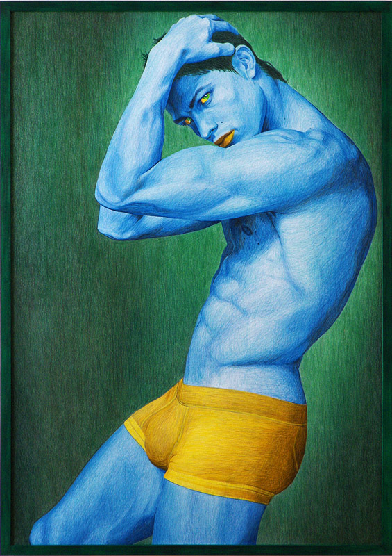
Marlon - 2011, color pencil on paper, 100 x 70 cm (top)
David - 2011, color pencil on paper, 70 x 100 cm
Cristiano - 2011, color pencil on paper, 100 x 70 cm (bottom)

Pam & Heidi By Katharina Arndt


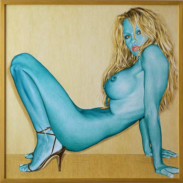
Heidi - 2011, color pencil on paper, 50 x 70 cm
Pam 2 - 2011, color pencil on paper, 80 x 80 cm
Pam 1 - 2011, color pencil on paper, 100 x 70 cm

The Scarletts by Katharina Arndt


The Scarletts by Katharina Arndt:

Scarlett 5 - 2011, 70 x 50 cm, color pencil on paper
Scarlett 4 - 2011, 80 x 60 cm, color pencil on paper
Scarlett 3 - 2011, 30 x 40 cm, color pencil on paper
Scarlett 2 - 2011, 50 x 40 cm, color pencil on paper
Scarlett 1 - 2011, 70 x 50 cm, color pencil on paper


Mittwoch, 31. August 2011

NYC artist R. Weber arriving in Berlin


After an historically eventful week on the east coast of the United States, first hit with a rare and major earthquake then days later being in the direct path of a hurricane the city of New York and its residents fared well. Irene the category 3 Hurricane was downgraded to a Tropical Storm by the time of it's landfall there sparing the city the wrath it could of caused in it's former state.
New York's John F. Kennedy Airport recently reopened and started to undo its massive tangle of delayed and cancelled flights. The artist made it to the terminal on time and the flight left the airport there last night with just a short delay. 

Now in transit somewhere over the Atlantic enroute to Berlin, with carry-on luggage containing the small scale oil paintings that depict various contraband items for a first exhibition here. These will accompany the drawings of Berliner artist Katharina Arndt in the upcoming Two Window Project exhibition 'Beauty Is the Hardest Drug'. Hoping for a safe landing and fair weather for the time in our city. 
Please join us Friday evening for the opening of this exhibition from 6:00 - 9:00 pm at the gallery and have a toast with the fine wines of southern Germany from the VDP German wine association. Both artists will be present.
Beauty Is the Hardest Drug
a dual solo exhibition by Katharina Arndt and R. Weber
opening reception for the artists: 2 September from 6:00 - 9:00 pm
exhibition: 3 September - 8 October 2011
Two Window Project
Torstrasse 154, D-10115 Berlin
www.twowindowproject.com


Dienstag, 26. Juli 2011

Beauty Is The Hardest Drug - Introduction


Introduction to Beauty Is The Hardest Drug by Serena Yang
To ask what is beauty today is to come face to face with the changing definition of beauty. Perhaps more than any other time in history, we are preoccupied with, even confused by beauty; it’s power, it’s pleasures, it’s style, and it’s substance. Beauty may not be the most important of our values, but it affects us all; today more than ever because we live in a Media Age where our visual landscape changes in seconds, and our first reaction to people is sometimes our last. Given this reality, the so-called ‘triviality’ of beauty suddenly seems not so trivial after all.
The beauty we see today is different, more complex. It is elusive, doctored and controversial. No longer is beauty limited to a pretty face or a pretty picture: beauty has come to personify and reflect the social and cultural issues of our day.
As we move through our relentless digital landscape, we must ask ourselves: when will beauty no longer be defined by commodified images – flawless features, without regard to what is underneath the surface? How are our judgements shaped by the images we see?
However we try to define beauty for ourselves, we are bombarded by idealistic images vying for our attention. The best of these images speak not to just our wallets but to our minds. They demand that we question society’s notions about appearance, and re-examine our own attitudes and ideas about beauty.
text by Serena Yang - Los Angeles based Journalist, Director, Documentary Filmmaker – www.serenayang.com
Beauty Is The Hardest Drug (German)


Vielleicht mehr als in irgendeiner anderen Zeit in der Geschichte, sind wir beschäftigt mit, sogar verwirrt von Schönheit: ihre Kraft, ihre Genüsse, ihr Stil und ihre Substanz.

Schönheit mag nicht der wichtigste unserer Werte sein, aber sie beeinflusst uns alle; heute mehr denn je, weil wir in einem Zeitalter der Medien leben, in dem unsere visuelle Landschaft sich in Sekunden verändert, und unsere erste Reaktion auf Leute manchmal unsere letzte ist.

In Anbetracht dieser Realität, erscheint die sogenannte „Trivialität“ der Schönheit plötzlich nicht mehr so trivial.
Die Schönheit, die wir heute sehen, ist verschieden, mehr komplex. Sie ist flüchtig, gefälscht und umstritten.


Schönheit ist nicht mehr begrenzt auf ein hübsches Gesicht oder eine hübsche Abbildung: Schönheit wurde Verköperung von und Reflektion auf die sozialen und kulturellen Probleme unserer Tage.
So wie wir uns durch unseren unbarmherzigen digitalen Alltag bewegen, müssen wir uns selbst fragen: Wann wird Schönheit nicht mehr durch kommerzielle Bilder bestimmt – makellose Gesichtszüge, makellose Erscheinungen, ohne Rücksicht auf das, was sich unter der Oberfläche befindet?


Wie sind unsere Urteile von den Bildern, die wir sehen, geformt?

Wie auch immer wir versuchen, Schönheit für uns selbst zu definieren, wir werden von idealistischen Bildern bombardiert, die um unsere Aufmerksamkeit kämpfen.

Die besten dieser Bilder sprechen nicht nur zu unserem Geldbeutel, sondern auch zu unserem Verstand.

Sie fordern, das wir Meinungen der Gesellschaft über Aussehen infrage stellen, und unsere eigenen Vorstellungen und Ideen über Schönheit nochmals prüfen.


text: Serena Yang - Journalistin, Filmregisseurin, Dokumentarfilmerin - Los Angeles - www.serenayang.com

translation from original English text by Stefan Lischewski
Beauty Is The Hardest Drug
a dual solo exhibition by Katharina Arndt (DE) and Rebecca Weber (USA)
opening reception: Friday evening the 2 September 6:00 - 9:00 pm
exhibition: 3 September - 8 October 2011
Two Window Project
Torstrasse 154, D-10115 Berlin
www.twowindowproject.com
twowindowproject@yahoo.de

Mittwoch, 13. Juli 2011

Beauty Is the Hardest Drug - text


Beauty Is The Hardest Drug
Two Window Project is proud to present new works by Katharina Arndt of Germany and R. Weber of the USA in their exhibition Beauty Is The Hardest Drug that will open at the galley space on Friday evening September 2nd marking the start of Berlin’s fall 2011 art season. Through their new works, these two artists explore the perception of beauty, celebrity and a host of the accoutrements of its darker side that have been associated with this phenomenon.
The title of the exhibition, “Beauty Is The Hardest Drug”, is attributed to Andy Warhol in particular and borrowed from an article in Interview Magazine from the 1970’s written by Bob Colacello. It was during this time that New York was at the dawn of it’s ‘Pop Revolution’ and a whole new generation was being fueled by Warhol’s probably more famous quote "In the future, everyone will be world-famous for 15 minutes", actors, artists, designers and models alike were all grasping for their quarter hour in the spotlight. Since then a variety of medicinal practices and potions that have been developed to cultivate a more enhanced or higher level of performance in this world of beauty helping to catapult some contenders to the front of the cue. 
Katharina Arndt’s super-realistic portraits meticulously rendered in color pencil depict easily recognizable personas from the current medias of television, movies and sports.
Her drawings of these 21st century icons display an ironic twist, as the color palettes for each are strangely beautiful, far from natural and purposefully arbitrary in their composition. As seen in her Scarlett works in this series, the subject’s hair in a pink tint and skin of darkened greens shades, suggesting an extraordinary, unearthly or possibly a manufactured beauty. Her drawings of these famous and familiar people that are loosely based on the images being flashed in the tabloids or on the screen help us to explore, from a totally new perspective, their perceived degree of beauty and celebrity. 
R. Weber’s delicate paintings in oil on wood panel in a plein air style are completely juxtaposed by their subject matter. In these smaller scale paintings, contemporary imagery such as a bottle of Botox with a syringe or various prescription and recreational drugs are depicted. The underlying harshness connected with these various pharmaceuticals has been softened by the artist’s brush strokes. In this series the artist dares to illustrate the many tabooed indulgences that have assisted many along their path to a higher state and may have also derailed some who might have abused them.
The pairing of these two talented international artists and the unique point of view of their works for the exhibition Beauty Is The Hardest Drug should make for a very entertaining perspective on this realm of beauty, celebrity and indulgence. 
The artists will be in attendance at the opening reception.
For inquiries please email to: twowindowproject@yahoo.de
Beauty Is The Hardest Drug
a dual solo exhibition with Katharina Arndt and R. Weber
opening reception: Friday the 2 September 6:00 – 9:00 pm
exhibition: 3 September – 8 October 2011
Two Window Project
Torstrasse 154, 10115 Berlin
www.twowindowproject.com

Sonntag, 3. Juli 2011

An Interview with artist R. Weber by Kay Weeks

The Visual Poetry of Mono no aware (物の哀れ)

A Conversation with Artist, R. Weber


Delicate rodent bones, scissors, a sand dune, bittersweet, pomegranates, a fire pit, a stick of incense with smoke rising in a thin column--what do these objects have in common, especially when R. Weber focuses on them as content for art? Beauty for sure.


Bittersweet.
Beyond that, R. Weber captures an object at a precise moment in time, while the progression of time simultaneously begins to affect form, cause natural decay, and extinguish the incense or campfire. But, for now anyway, the painting of the object as well as the artist and viewer remain. They and we, too--at different moments--will become small points on the timeline and vanish into memory.

Beautiful sadness, the ephemeral, fleeting. In the Japanese language and culture, this is Mono no aware (物の哀れ, mono no aware, literally "the pathos of things"), The term is used to describe the awareness of impermanence (Jap. 無常 mujō), or the transience of things, and a gentle sadness (or wistfulness) at their passing.

Portrait of a distinctive carrot.
So, in R. Weber's paintings, beneath the glow , the patina of time, oxidation, there is this hard reality--the understanding that the object is in the process of disintegration. In the case of her fruit--or this gnarled carrot--it has likely disappeared by now, but the record of it--in poetic terms--remains. In our conversation about art, the artist used Japanese terms: Shibui, Wabi-Sabi...then, I found Mono no aware and think it applies even more closely to what is painted. Weber's paintings are visual poetry--in a way, the romance of "passing."

At what point does this knowledge that all will disappear in time push us toward a nihilistic philosophy. Why bother, then? I put that one to rest immediately. Weber told me that one hears the phase "Inshallah!" frequently in New York City..."God willing." I think we all have a phrase that holds similar meaning, but has heavier implications. For example, when we say "See you!" or "Have a good day!" we know underneath the cheer that there is actually no assurance it will happen. Someone I know says that tomorrow is only a concept.

Great Dune.
As opposed to the fatalistic and perhaps ironic Que Sera Sera or Inshallah, the objects or scenes Weber paints can't talk or rely on Other (e.g. religious or philosophical constructs) for hope or continued existence. They simply and poetically...disappear. But the paintings themselves are held in time--for now and future years---gracefully and that is what we see, as viewers. It is a thoughtful contradiction.
_____________________________________
I remember the book title, Only Earth & Sky Last Forever. Recent upheavals, tsunami, violent winds, potential meteorites...we are whistling in the dark to accept that notion of some planetary "forever continuity."

In my 30 professional years working in historic preservation, I was writing the same thing, so the conversation with R. Weber resonated deeply with me, The notion that we can’t recover the physical past in any authentic way (restoration introduces new elements and reconstruction means all new material).
Persimmons in a bowl.
In brief, the small natural or man-made objects that Weber chooses to paint are gentle reminders of our time here, our love, hopes, dreams and despair. Although they can be recorded through painting or scientific endeavors, ultimately, the records will disappear--as we will. We can't stop the effects of time; and time is always change. But while we are here, the art glows with life, is brilliant, small and authentic.

Art & Poetry - Thematic similarities. In his startling poem, Limited, Carl Sandburg describes in a matter-of-fact way the passage into nothingness of all things. I shared the poem with the artist and we agreed to include it in this essay.

Limited
I AM riding on a limited express, one of the crack trains of the nation
Hurtling across the prairie into blue haze and dark air go fifteen all-steel coaches holding a thousand people.

(All the coaches shall be scrap and rust and all the men and women laughing in the diners and sleepers shall pass to ashes.) I ask a man in the smoker where he is going and he answers: Omaha.”

Carl Sandburg (1878–1967). Chicago Poems. 1916.

Granted, Carl Sandburg is very tough when he writes about what I call the "mortality container," our lives--with the amazing machinery we employ to make it go even faster in reference to the larger expanse of time. But there are touch points and Weber recognized them immediately.

Here are more of R. Weber's exquisite paintings:

Anna's Bones. This is in my collection.

Fire Pit.

Butterfly.

Scissors.

Freitag, 24. Juni 2011

In Black and White


image: Scheisse - [R I P O ], 2011, china ink on paper, 50 x 70 cm

In Black & White

opening reception: Friday the 1 July 6:00 - 9:00 pm
exhibtion: 2.July - 27.August 2011


with artists:

Artúr van Balen
Julia Bulik
[ R I P O ]
Hannah Parr
Ingrid Simons
Jürgen Schwämmle
STiNK!

White:
A color without hue at one extreme end of the scale of grays, opposite to black. It is the ultimate limit of a series of shades of any color.

Black:
The color at one extreme end of the scale of grays, opposite to white, absorbing all light incident upon it. Compare white.


Allow yourself to be transported to a time when the visual media of today still awaited discovery. A family gathers around the television in 1940's American suburbia, eagerly awaiting the evening news program. The newscaster's thick-framed glasses contrast sharply with his bleached smile as his tinny voice announces war in a foreign country. The family listens intently, their naivety at that moment reverberating in the simplicity of the gray scale screen. They remain unaware of the technological advances that would occur in the next seventy years, and to the probability that the advent of the color television, computers, and entertainment systems, would quickly drain the simplicity from their existence. Imagining this moment allows us to pay homage to an age when people focused more on what they had, as opposed to what they thought they needed; a time where the word “iPod” would have triggered questions about Ray Bradbury’s upcoming science fiction novel. For many, through faded photographs and early films, black and white triggers a feeling of nostalgia for this seemingly prehistoric era. For others, perhaps the youth of today, this time in our history seems naught more than a frightening technological dead-zone. The world is now a very different place: futile wars are waged and multi-million dollar companies thrive, while communication technology continues to advance at a record-breaking pace. Simultaneously, the media bombard us with chaotic messages, attempting to drown us in a multi-colored sea of propaganda. This exhibition, In Black & White, allows us to explore the complexity of simplifying artwork to the confines of black and white. When considering the impact of this process on the artists’ works, you may be surprised to find that when color is extracted, black and white seems to be all we need.

For many of the artists involved in this exhibition, removing the element of color was a challenging restriction, one which demanded a certain amount of mental adjustment. How is it that simplification has become such a labyrinthine process? Consider in our society the infrequency with which one observes a black and white advertisement while flipping through a magazine or walking down the street. Most advertisers associate completeness and wholeness with color, giving the impression that lack of hue connotates a lack of meaning. Somehow, color has become synonymous with complete expression- but is that really the case? Defiantly answering this question is the work of Hannah Parr. She employs themes of contrast in chaos while diverging from her signature use of color, proving that the pieces speak to us profoundly even in their black and white state. Artúr van Balen's thought-provoking work Sainsbury Chickens seems to mock the aforementioned notion of achromatic insignificance, as the starkness of the white porcelain draws even more attention to the physical shape of the chicken carcass by advertising a message of morality. van Balen’s message, which warns against the dangers of commodification, is communicated effectively without the use of pigment. The lack of color causes the viewer to focus more on the subject itself, and to observe how the crassness of the chicken carcass contrasts severely with the delicacy and elegance implied by the use of porcelain as the medium.

To further consider the concept of elegance as it is associated with the use of black and white, consider a historical event in which this theme prevailed through dress and decor: Truman Capote's iconic Black and White Ball of 1966. This event, considered to be the pinnacle of high society, turned a simple invitation into the ultimate social validation - receiving the invitation would determine whether you were 'in' or 'out' of the elite social circle. This affiliation between elegance and the use of black and white allows the viewer to consider the piece Sheisse by graffiti artist [ R I P O ] in a different light. This work dances between contrasts of black and white elegance, as seen in the art nouveau intricacy of the sweeping arcs and floral patterns, while at the same time presenting us with undefined splotches of grey that bring a certain roughness to the piece. Similarly, Julia Bulik's work, with it's intricate detail and distinguished botanical flair could have easily been featured at Capote's grande fête as an example of modernity and tastefulness.

Consider the meaning of the phrase 'in black and white'. Its definition indicates that a duality is present - that something must be either one way or another. This leaves leaves no room for the existence of the metaphorical grey area, and allows us the opportunity to think in antonyms such as positive-negative, right-wrong, correct-incorrect, honest-dishonest. Similar to the dichotomy present in Capote’s ‘in’ or ‘out’ guest list decision, dualities present themselves in all of these artists’ pieces. Jürgen Schwämmle's work with its simple tape-on-cardboard construction provides a certain honesty through the use of these materials. Inversely, a certain dishonestly is presented to the viewer by the addition of a YouTube play bar at the bottom of the piece, indicating that the scene occurred in reality, which, judging by the conflicting images he presents, was not the case. Similarly, the use of YouTube ties us back to the theme of black and white simplicity before the advent of modern visual technology, while complexity presents itself in through the use of this social media platform- one of the front-runners in the race to complicate the media landscape. The work of STiNK! remains ripe with political and social commentary and is interesting to consider in relation to the eternal question of right and wrong- Not only in terms of the artist’s subject matter, but also regarding society’s view of street art as either right or wrong, legitimate or illegitimate.

Returning to black and white as being synonymous with simplicity and purity, the lack of color often causes us to pay more attention to other elements of the piece. Similar to how form took on an increased importance in the work of van Balen, the play between black and white in Ingrid Simmons's piece demonstrates how the use of these shades causes us to draw our attention to the element of form in nature. With the landscape devoid of color, there is now a simplicity and candor present in the way the tree's branches boldly contrast the blanched sky as the black banks separate to make way for the trickling stream.

Clearly, the use of black and white as the theme of this exhibition symbolizes a variety of concepts. Whether representative of the restrictions placed on an artist's creative process, a symbol of simplicity and elegance, or instead a window into the past when the world was viewed through a black and white television screen, In Black & White allows the viewer to ponder the complexity that is black and white.


Text by Sarah Hucal, B.A. University of Michigan, Freelance Travel, Arts & Culture Writer, NYC


Two Window Project
Torstrasse 154, D-10115 Berlin
www.twowindowproject.com

Donnerstag, 23. Juni 2011


In Black and White - summer group exhibition

with artists:
Artur van Balen (NL)
Julia Bulik (DE)
Hannah Parr (UK)
[ R I P O ] (USA)
Jürgen Schwämmle (DE)
Ingrid Simons (NL)
STiNK! (UK)

opening reception: Friday evening the 1 July 6:00 - 9:00 pm
exhibition: 2 July - 27 August 2011

For additional information or preview please contact: twowindowproject@yahoo.de

Montag, 13. Juni 2011

In Black and White

Sainsbury Chicken - Artúr van Balen, 2010, KPM porcelain edition


In Black and White

upcoming group exhibition at Two Window Project with the artists:

Artúr van Balen (NL)
Julia Bulik (DE)
Hannah Parr (UK)
[ R I P O ] (USA)
Jürgen Schwämle (DE)
Ingrid Simons (NL)
STiNK! aka Stephen Haim (UK)


opening reception: Friday 1 July 6:00 - 9:00 pm
exhibition: 2 July - 27 August 2010

for more information or preview please email to: twowindowproject@yahoo.de

www.twowindowproject.com

Samstag, 28. Mai 2011

Plan B

Plan B
group exhibition with works by Ernesto Canovas, EMESS, Shepard Fairey, STiNK! aka Stephen Hiam

opening reception: Thursday evening the 2 June 6:00 - 9:00 pm
exhibition: 3 June - 25 June 2011


The title ‘Plan B’ suggests that an alternative choice was made during this exhibition’s conception – either this or that, not ‘A’ but ‘B’. When plan ‘A’ implodes its alternate, plan ‘B’, is mobilized – and occasionally ‘B’ can turn out to be an ideal choice, as is the case for this exhibition. The title begs for an interrogation of choice and an examination of alternatives within dichotomous relationships – the street/the gallery, Pop Art/Fine Art, consumerism/altruism, mainstream/subculture – asking the viewer to contemplate positional distinctions and to make choices. ‘Plan B’ also questions those binary divisions by bringing together street art and Pop-influenced works that challenge material and conceptual conventions through their seamless incorporation of disparate styles and imagery. Street art is something considered to occur ‘out there’ in the urban landscape, and it is informed by both revolutionary thought and quotidian commercial materialism; bringing that work ‘in here’, into the gallery, breaks down barriers between the venerated exhibition space and the gritty environment of the city street. In the 1960s Pop Art obliterated the distinction between commercial and fine art, inserting an anti-establishment ethos into the conventional gallery space and challenging the viewer to consider the constitution of a work of art. Street art endeavors to build upon the legacy of Pop through provoking the deliberation of cultural, sociological and aesthetic content from inside the white cube of the gallery. The gallery legitimizes street art by deeming it a worthy subject for rigorous intellectual discourse and by making it commercially viable. As street art is based on radical ideas that eschew artistic conventions and position it in critique of the gallery, it is somewhat ironic for street art to reside in the space that it critiques. This suggests that ‘Plan B’ is blurring binary distinctions, and creating a material and discursive space that includes ‘both’.

In Ikke and Queen EMESS incorporates Pop elements in a street manner, being satirical whilst paying homage, through his use of bold colors and the iconic images of George Washington and Queen Elizabeth II. Those visages, which were replicated from American and British currency, epitomize the ‘brand’ of their respective cultures and signify money. In Danish Ikke means “no” or “isn’t it so”, and its homonym in American English, “icky”, means distasteful or gross. EMESS incorporates the face of the founding father of America, a veritable King akin to Britain’s Queen, into IKEA flat pack instructions, linking the US ‘brand’ with Sweden’s leading corporate entity – associating the naissance of the United States with consumerism, relative quality and built-in obsolescence. Isn’t it so?

Shepard Fairey’s Obey currency pieces offer a simulacrum of money, which critiques aspects of political economy. With the phrases “indiscriminate capitalism”, “supply and demand” and “obedience is the most valuable currency”, inscribed in juxtaposition with a grasping hand and a skull, Fairey asks the viewer to contemplate the use and exchange value of goods purchased through submission and compliance. This work strongly correlates to the contemporary political and financial landscape – many countries are in recession, currencies are destabilized, banks have been nationalized, billions are being spent on wars, and taxpayers are carrying the burden of the mounting costs, with no end in sight, thanks to the rampant greed of a privileged few.

Expired by STiNK!, combines graffiti inspired figurative elements, depicting human and environmental decay, with descriptive language indicating technical failure and loss of protection. The construction of the piece is reminiscent of a dollar bill – figurehead in the center, rectilinear shape, with writing incorporated into the image – which may allude to the role of economic capital in the decomposition of the individual and/or the state. Ernesto Canovas’ Bombs, Bombs, Bombs and Honey I’m Home bring to mind notions of fetishism (commodity and otherwise), destruction, fantasy, and escapism, attesting to the breadth of what money can buy for the individual and/or the state.

The objects in ‘Plan B’ are signs that express or communicate ideas. The sign, in linguistic terms, is comprised of the signifier (the form or art object) and the signified (the concepts it conjures in one’s mind). Shared meaning is developed through a shared understanding of the signifier, which is a socially constructed phenomena. The polysemic quality of art objects can create confusion on the part of the viewer – they can have different meanings for different people, based on their individual cultural norms and understandings. There may not be a defining feature common to all of the works or artists in ‘Plan B’, yet a relevant pattern of cultural significance can be found in the artwork’s relationship to money – literally through the depiction of imagery co-opted from actual bank notes in the work of EMESS, figuratively in the work of Fairey’s simulated currency, tangentially in the structural composition of the piece by STiNK!, and notionally in the work of Canovas – and in money’s relationship to the global financial crisis. ‘Plan B’ provides an excellent opportunity to engage with artwork that encourages the viewer to think differently about ordinary things, such as cash, in context with contemporary social, cultural and political concerns.

text by Kimberly Keith, PHD, Researcher, Centre for Urban and Community Research, Goldsmiths, London


For more information or preview email to: twowindowproject@yahoo.de

Two Window Project
Torstrasse 154, 10115 Berlin-Mitte

www.twowindowproject.com